Meanwood Valley
Urban Farm
All living things needs light to grow. A brand identity built around a cultivated community.
-
Since 1980, Meanwood Valley Urban Farm have cultivated something far bigger that it’s 26 acres of green space, it’s cultivated a community of growers, thinkers, teachers and doers.
However, with some recent feedback from local visitors reducing the farm to a ‘one-dimensional day out’, it was felt the farm needed to shout about everything else it does, beyond being ‘a farm with just a few animals’— including it’s charity and education work with schools and adults with learning difficulties.
With help from a set of interviews and feedback forms, a brand positioning centred around ‘growing together and cultivating communities’ was written. This became an outward facing story to future funders and users of the farm, mapping it’s quite radical beginnings to becoming a home to many different people from many different backgrounds.
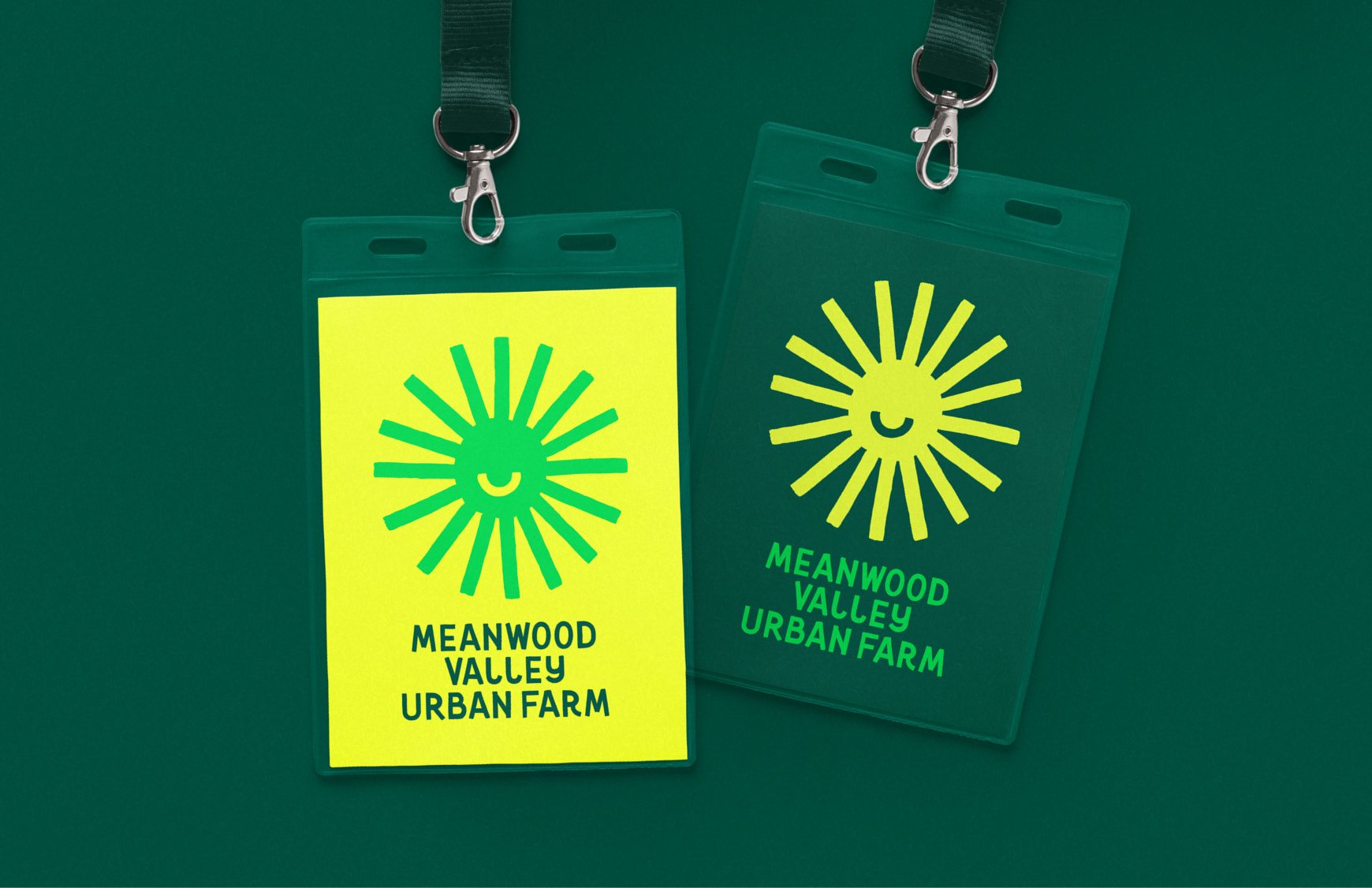
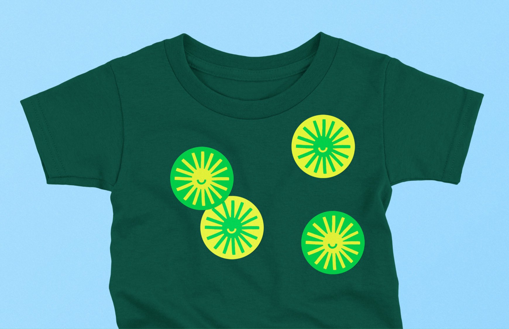
Each part of the brand identity is influenced by the brand positioning. Including a hand-painted sun symbol centred around the idea that all living things need light to grow. Both in the sense of sunlight to grow farm produce, but also the farm being a positive personality, to the rich mix of people it welcomes.
Finished with a smile the sun symbol helps reinforce the farms charity status, whilst being an all-encompassing symbol for the farms future ambitions of supporting people and the planet.
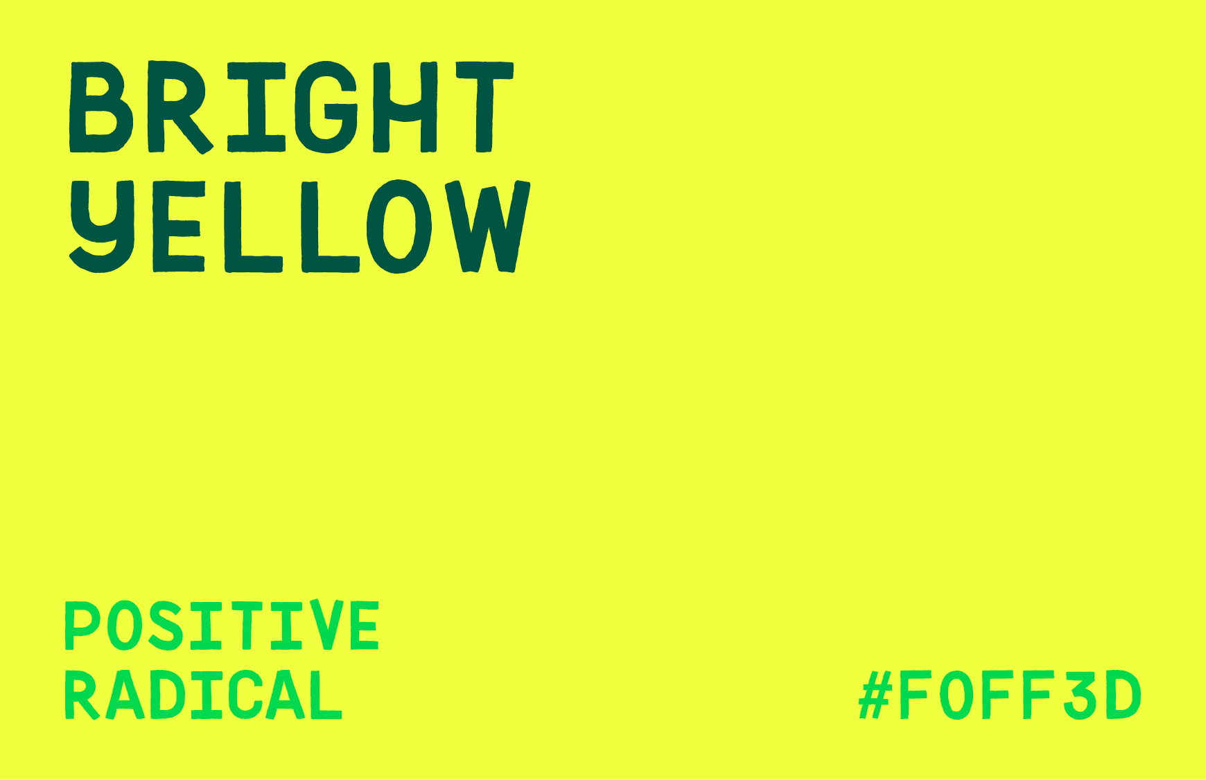
Bright yellow was used to further reflect that same positivity, matched with a deep Forest Green for balance—adding a sense of trust and support it’s educational offering.
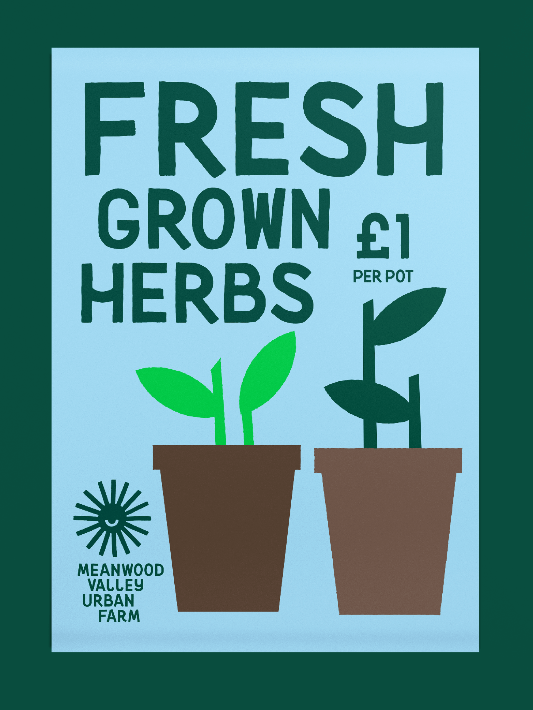
A set of illustrations merge animals big and small with plants and produce, further helping to reinforce the idea that the farm is not exclusively one thing or another. This unusual mix added a playfulness that was missing from the previous brand.
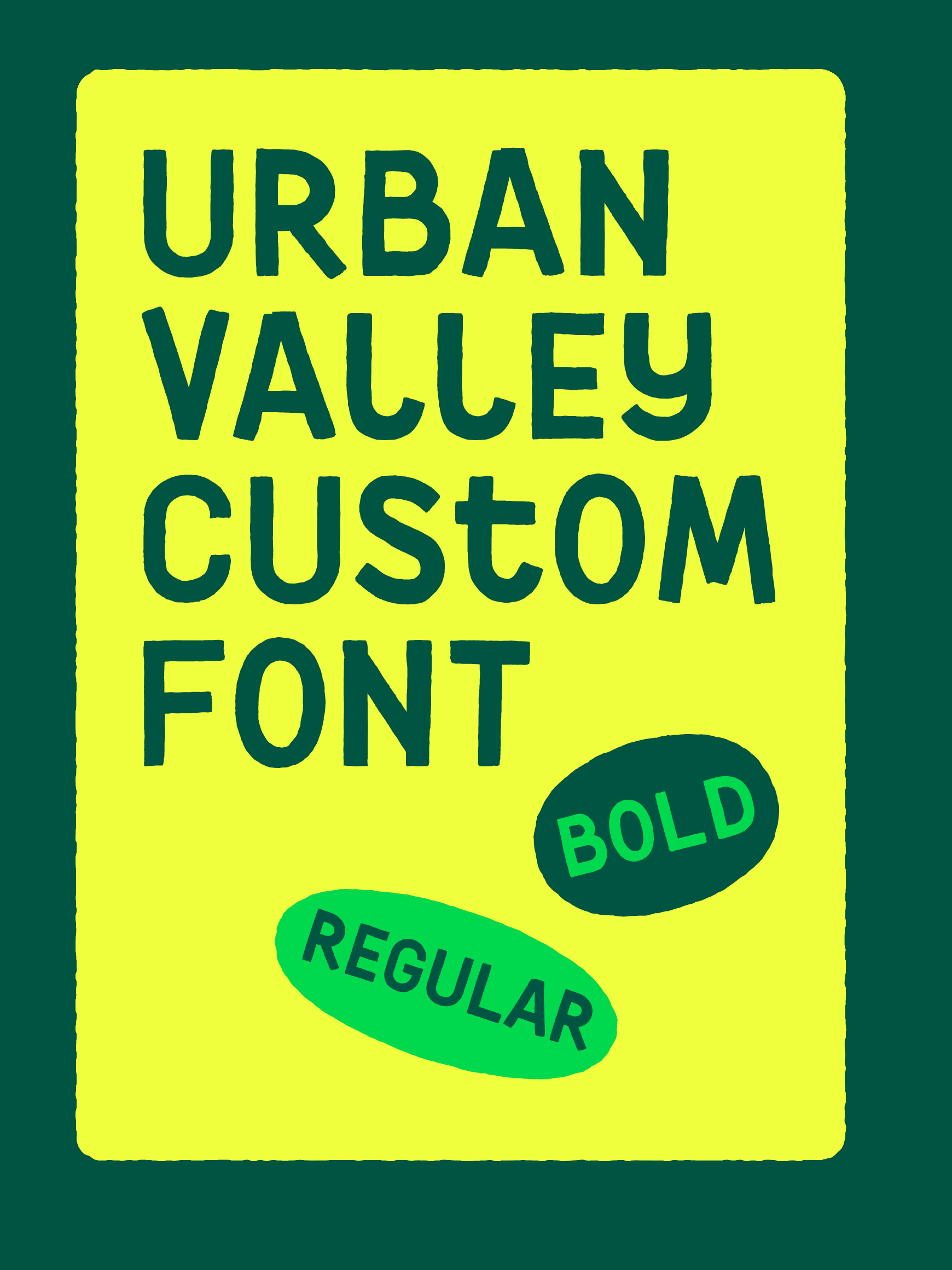
Urban Valley was the name given to a hand-painted font created as part of the brand identity, which acts as a nod to the community of hands-on doers that work tirelessly on the farm, whilst building on the many hand painted signs already in use. A thick and thin paintbrush was used to create both a bold and regular weight of letters and symbols.
The Urban Valley font also acts as subtle nod to the farms radical beginnings, which saw the unused plot of land claimed by a community to bring a rural experience to city folk, instead of being used for development.